
Crew Crosscheck
From Aviation Practice to Training Philosophy
The name Crew Crosscheck draws directly from aviation practice, where “crosscheck” is a procedure used by cabin crew to confirm that safety actions have been correctly completed. This simple but vital act ensures accuracy, accountability, and shared responsibility. In the same way, our philosophy centres on the validation of truth. Just as crew members crosscheck one another to guarantee safety, we train candidates to crosscheck their understanding, motives, and separate damaging interview myths from truth. The name reflects both the discipline of aviation and the integrity we bring to interview training.
The crosscheck nature of the brand also reflects our own commitment to validating our training against airline operations, regulatory standards, and industry expectations.
Design That Reflects Discipline
From Aspiration to Action | From Candidate to Crew
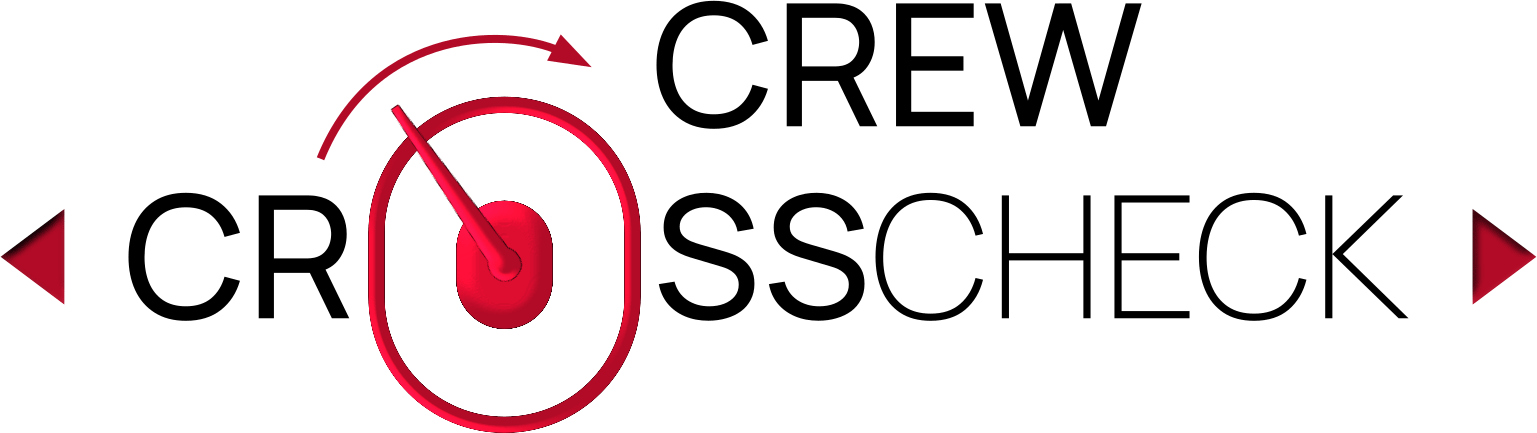
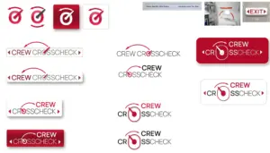
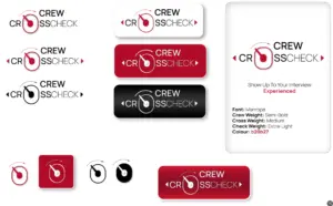
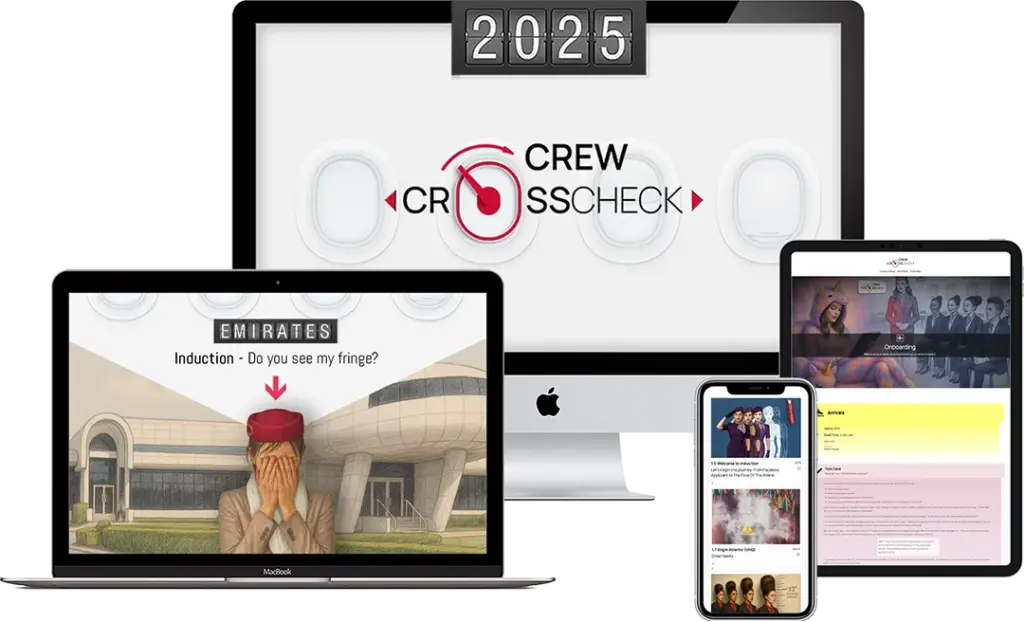
The Crew Crosscheck logo design captures the essence of the brand and its commitment to preparing candidates for airline interview success.
The design takes its inspiration from the iconic shape of an airplane window — instantly recognisable, aspirational, and symbolic of new horizons. A sliding handle grounds the composition; when animated, it moves into the crew position, reinforcing the brand’s mission of guiding candidates through the transition from aspiring applicant to hired crew.
Red directional indicators do more than reference aircraft emergency exits; they represent the multi-directional nature of our training philosophy. Just as there are many exits on an aircraft, there are many valid paths for aspiring crew. No single approach, style, or candidate journey is the same. The arrows remind us that interview preparation is not one-size-fits-all. Each applicant brings unique strengths, cultural perspectives, and career goals, and our training adapts accordingly.
Deep red draws from aviation safety signage, where visibility and attention are critical.
The result is a mark that blends technical authenticity with aspirational purpose.
The Crew Crosscheck icon stands strongly on its own, independent of the full word-mark. By isolating the icon, the brand maintains a visual shorthand that is both practical and powerful — compact enough for small-scale use, yet rich in symbolism.
Concept Design
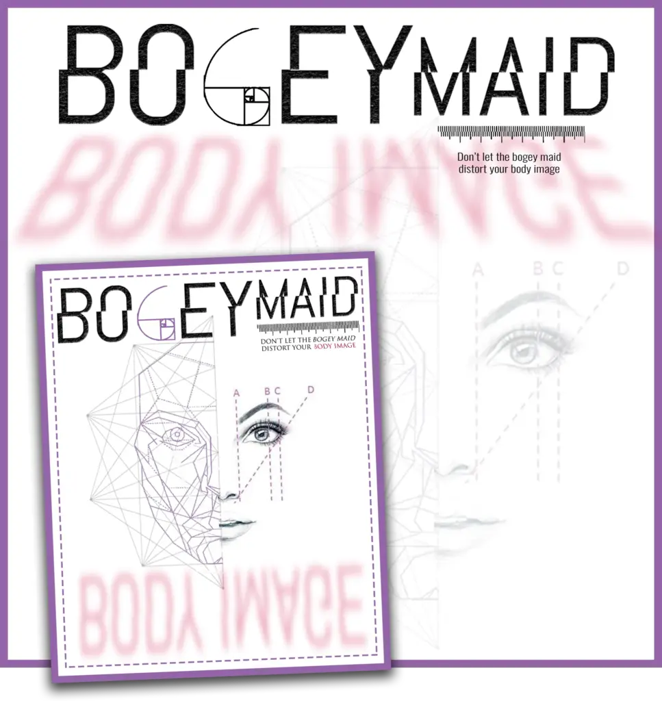
Bogey Maid
The Bogey Maid logo is a conceptual exploration of body image distortion. The name itself is an acronym for Body Image, highlighting the central theme of perception versus reality. The design embodies the psychological distortion often experienced by those with body dysmorphic disorder.
The typography deliberately incorporates irregularities and visual disturbances to reflect how self-perception can become skewed. The mirrored reflection of the words represents the deceptive nature of mirrors — what one believes they see versus what truly exists.
A notable feature is the ‘G’, stylised as a golden mean symbol, referencing the classical ideal of perfect proportions. Its inclusion questions the notion of perfection and how it influences our understanding of beauty and self-worth.
The Literary Designer

This mark represents the intersection of literature and design.
The Literary Designer logo captures the craftsmanship and precision of book design. The visual concept is rooted in the anatomy of print production — referencing trim guides, margins, slug, and bleed — to symbolise the technical and creative layers of the publishing process.
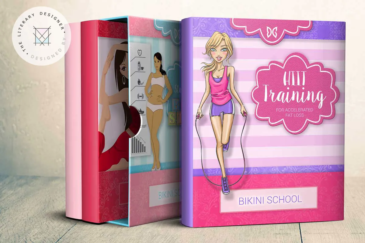
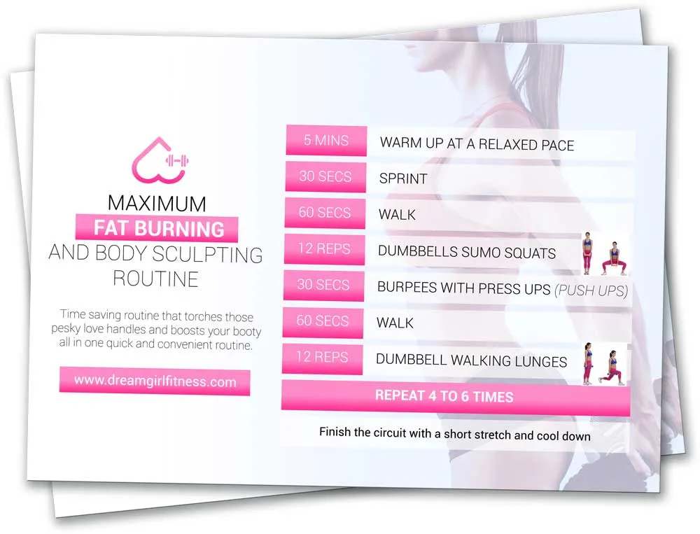
DreamGirl Fitness
The DreamCurves logo features an upside-down heart as its centrepiece, symbolising the female form — accentuating the curves of the hips and a tapered waist. Integrated into the design is a small dumbbell, representing the strength and empowerment that come from weight training — a core component of the programme.